The Significance of a Red or Blue 12
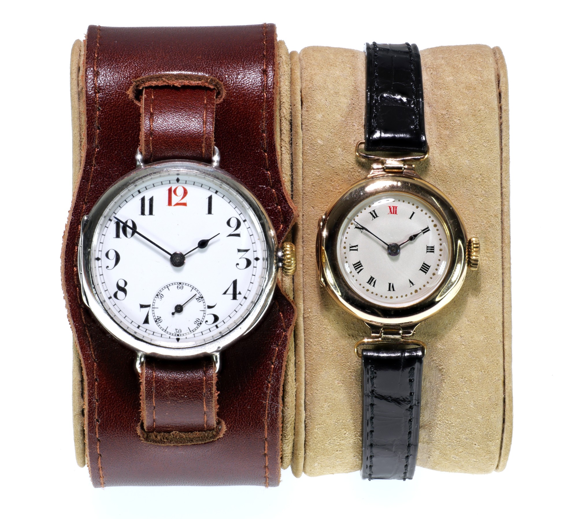
My grandfather's and grandmother's Rolex wristwatches
Click image to enlarge
Many early wristwatches have the 12 on the dial picked out in red like my grandfather's wristwatch pictured here, and sometimes (more rarely) blue. Why is this?
Many sellers puff up a red or blue 12 as if it means that it is a “military” watch, or something very significant for some unspecified reason. Some people even seem to think a red 12 identifies a watch as a Rolex - and are generally disappointed; early Rolex wristwatches certainly did often have red 12s, but then again so did most other makes of wristwatch, and for the same reason.
Note also that both my grandfather's and my grandmother's wristwatches have red 12s. The red 12 was not a sign of a man's watch, it was used just as much on ladies wristwatches in the early days of the wristwatch.
I have never come across any documentary evidence about the "red 12", but as an engineer with a special interest in ergonomics I think it is pretty clear that picking out the 12 in a contrasting colour does have more significance than just a style or fashion. It was certainly in use on ladies' wristwatches well before the First World War, when wristwatches started to be used by men for the first time in great number, so it is definitely not a sign of a man's watch or a military watch.
The real reason for the red and blue 12s on early wristwatches is because they were the paradoxical combination of a savonnette (hunter) movements in Lépine (open face) cases. Because they were open face they looked at first glance like a Lépine open face watch adopted for wrist wear, but they weren't and the 12 was in a different place to where it could be found on a normal Lépine watch, so the 12 was picked out in colour to draw attention to this.
Early Wristwatches

Lépine Layout: Click to Enlarge.

Savonnette Layout: Click to Enlarge.
A Lépine watch has its small seconds on the opposite side of the dial to the pendant and number 12. What is really needed for a wristwatch is a savonnette layout where the crown is at 3 o'clock and the number 12 and small seconds are at the top and bottom of the dial. But the problem with a savonnette watch is that it has a metal lid over the dial, circled red in the image, which must be raised to read the time. This requires the use of both hands and defeats the purpose of a wristwatch, which was to leave one hand free.
So a wristwatch requires the use of a savonnette movement in a Lépine case. At the time, everyone knew where the 12 was on a Lépine cased watch – opposite to the crown. But this was not true for one of the new-fangled wristwatches! So the 12 was picked out in red to highlight this.
The contrasting colour of red or blue for the figure 12 was used establish the correct orientation of the watch by drawing the eye to the location of 12 o'clock. Familiarity with the watch dial means that we don't often pause to think about how complex its display is. There are very few instruments which use two, or even three in the case of a centre seconds dial, coaxially pivoted hands, and none that are in such wide use. From an ergonomic perspective, this could be a nightmare; and yet, with the hands carefully designed so that it is apparent which is the hour hand and which is the minute hand, we can read the time to the exact hour and minute from a watch dial at a glance. And we can do this even if the numerals are replaced by markers, and even, in the extreme example of the Movado "Museum" watch, if the markers themselves are completely absent - absent, that is, apart from a single dot at 12 o'clock. It all hinges on the position of 12 o'clock. Which is why when the wristwatch was new, the 12 was often picked out in a different colour: it's all due to ergonomics.

Two Pocket Watches - Find the 12s!
The two pocket watches in the picture look pretty similar, until you realise that the one on the right is a most peculiar beast, an "open face hunter". Hunters normally have a flip open metal cover which protects the crystal and has to be opened to read the time. The cover is usually released by a button on the end of the pendant. The dial is arranged so that the pendant is at 3 o'clock, rather than 12 o'clock as on an open faced pocket watch. This is because the easiest way to use the watch single handed is to hold it in the palm of your hand and press the button with your thumb, while still holding, say, the reins of your hunter (horse) in the other. The lid then flips open sideways towards and you can read the time. An open face hunter is really a self contradiction, but they do exist. In America they are reasonably common and are called sidewinders. If this one had a red 12 it would be a lot easier to immediately pick out the 12. But in fact red 12s are rare on pocket watches
Medical Uses?
The advert from 1916 by Smith & Son Ltd. reproduced here is quite interesting. It shows two trench watches, called the "Smith's 'allies' watch wristlet", both of which have Borgel "screw in" dust and damp proof cases, luminous hands and numerals and unbreakable crystals, or "unbreakable front" as the advert puts it.
The watch on the right has a sweep centre seconds hand and is called a "Medical Watch", said to be invaluable for hospital work. The additional red cross above the 6 on the dial emphasises this intended use, although of course there is no guarantee that such a watch was actually used in a military hospital. The centre seconds adds considerably to the cost of the watch at four pounds and fifteen shillings.

Smith and Son advert May 1916 – Click image to enlarge
Both of these watches would have had red 12s. The thing that marks out the watch on the right as a medical watch is the sweep centre seconds hand, which would have been very useful when taking a pulse. It is much easier to read than the small sub-seconds dial of the watch on the left. The small sub-seconds dial was useful in the field as a quick check to make sure that the watch was working, especially in a front line trench where you wouldn't have been able to hear the watch ticking due to the noise of the guns.
Conclusions
Picking out the 12 in a contrasting colour helps to locate the 12 quickly and easily; it's an ergonomic thing, and was important when wristwatches were new because they were a savonnette movement in a Lépine case.
- Red 12s were commonly used on early wristwatches, so a red 12 might identify a wristwatch as being an early one. But it doesn't guarantee it!
- A red 12 doesn't automatically mean that the watch was a military watch, or a medical watch, and it certainly doesn't uniquely identify a Rolex – although of course it could be any one, or all, of these. You just can't say from the colour of the 12; a red or blue 12 doesn't prove anything.
- A red or blue 12 shouldn't add to the value of a watch. It is very easy to paint the 12 red or blue, or any other colour, so anyone could do it – even on the cheapest of watches: there are no "barriers to entry", unlike making a fine quality precision movement. One thing you can look out for though is whether the contrasting colour of the 12 has been fired into the enamel of the dial, or merely painted on afterwards, which could even have been done recently, see Enamel Dials.
In reality, it is the design, appearance, condition, and ultimately the quality of the case and the movement, that determines the value and historical significance of a watch, not the colour of some paint on the dial. However, if I were selling a watch and it had the 12 picked out in a contrasting colour, I would certainly mention it!
If you have any comments or questions, please don't hesitate to get in touch via my Contact Me page.
Copyright © David Boettcher 2005 - 2026 all rights reserved. This page updated January 2026.
Back to the top of the page.